Building a 3D Website Without Sacrificing Performance
What six interactive donut models taught me about balancing playful 3D experiences, mobile performance, and a clear path to purchase.
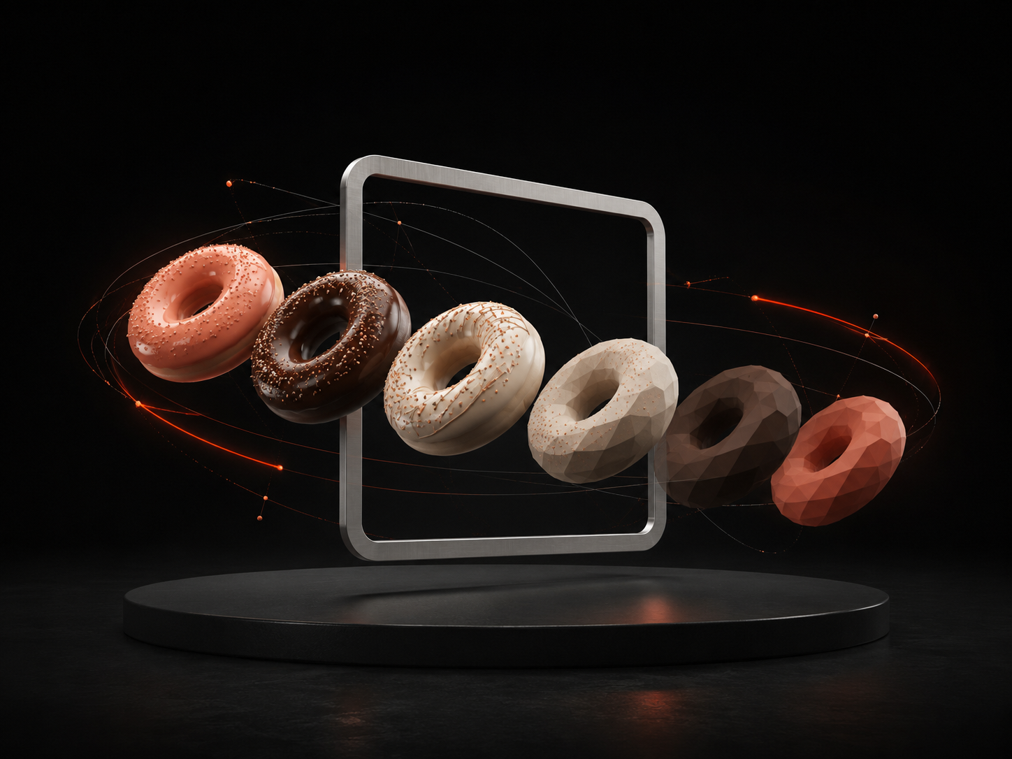
A 3D object can make a website memorable in a way that a flat product image cannot. It can also make the same website slow, unstable, and frustrating on the phones people actually use. I faced that trade-off while building Donut Drool, an e-commerce website for an eggless donut bakery with outlets in Kathmandu and Lalitpur. The idea was simple to describe: let visitors see playful donuts burst into the hero, explore the flavors, and feel the personality of the bakery before ordering. Making that idea work smoothly across devices was the real design problem.
Start with the experience, not the technology
Three.js and React Three Fiber gave me the tools to place real-time 3D models in a React interface, but the tools were never the point. The goal was to make the product feel playful and tangible. Donut Drool has more than 25 flavors, so the site needed energy without making the menu harder to understand. I kept the most expressive 3D moment in the hero and allowed the rest of the interface to become calmer. That separation matters: if every section tries to be the main event, visitors have to work too hard to find products, prices, locations, and opening hours.
Treat every 3D model as part of the page budget
The hero uses six custom GLB donut models, each with its own scale, position, rotation, geometry, and texture cost. Loading them all without a plan would delay the first useful view of the page. I treated the models like any other performance-sensitive asset: reduce what the browser has to download, avoid doing expensive work before it is needed, and make the surrounding page useful even while the scene is preparing. A 3D website should still feel like a good website before the canvas becomes interactive.
Design motion for different devices, not just smaller screens
Responsive design is often discussed as a layout problem, but interactive sites also need responsive behavior. A desktop can support a wider scene, more simultaneous movement, and richer scroll choreography. A phone has less space, less processing headroom, and a user who may be on a slower connection. For Donut Drool, I used lazy loading and media-query-gated animation so mobile devices did not automatically inherit every desktop effect. The mobile version keeps the identity of the experience while doing less work. That is not a compromise; it is a better interpretation of the same design.
Make animation explain hierarchy
The burst animation gives the hero its first impression, while GSAP scroll reveals support the content that follows. I found it useful to give each kind of movement a job. Product motion creates appetite and personality. Text reveals establish reading order. Smaller interface transitions confirm that an action has happened. When an animation could not explain, guide, or respond, it was usually a candidate for removal. This kept the site lively without turning it into a demo reel visitors had to fight through.
Keep commerce information outside the spectacle
A bakery website still has practical work to do. Visitors need to compare flavors, see prices, browse cakes, pastries, bread, cookies, and drinks, and find the right outlet. Those actions depend on readable content and predictable navigation. The interactive layer can attract attention, but product information has to convert that attention into a decision. Separating the visual hook from the purchasing details also helps search engines understand the page because important information remains available as normal structured content rather than being trapped inside a canvas.
Test the feeling as well as the frame rate
Performance tools can show loading time, layout shifts, and responsiveness, but numbers alone do not tell you whether an experience feels impatient. I tested the sequence as a visitor would experience it: when does useful content appear, can I scroll immediately, does the motion react naturally, and does anything delay the route to a product or location? Technical measurements helped locate problems; repeated use helped decide which problems mattered most.
What I would carry into the next interactive build
The biggest lesson from Donut Drool is that performance and personality are not opposing goals. Constraints make the creative direction clearer. Put the richest interaction where it creates the most value, give every animation a reason to exist, adapt behavior to the device, and keep the core content fast and accessible. That approach makes it possible to build a 3D website that people remember for the experience instead of the loading screen.