When Animation Improves a Website and When It Ruins It
A practical way to decide whether motion is guiding attention, explaining change, and adding character—or simply making the interface harder to use.
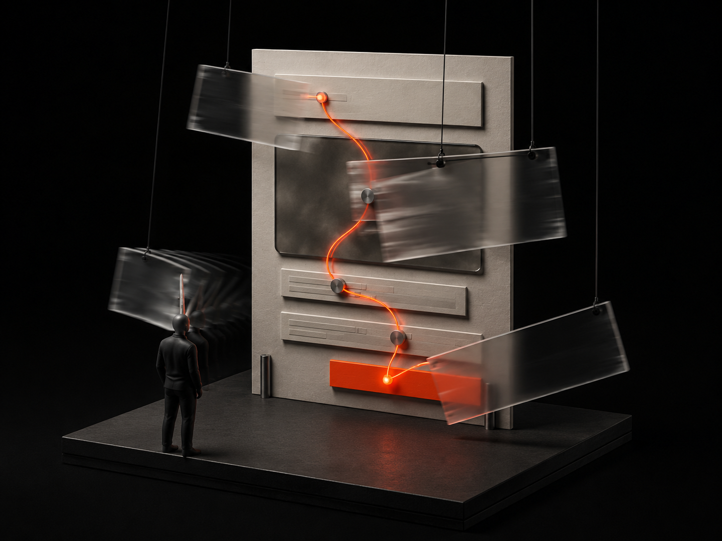
Animation can make a website feel clear, responsive, and alive. It can also turn a simple page into an obstacle course. The difference is rarely the animation library or the number of frames per second. It is whether the movement helps a visitor understand what changed, where to look, and what happened after an action. I enjoy building expressive interfaces with tools such as GSAP, Framer Motion, and Three.js, but the more motion a project can support, the more important it becomes to decide what the motion is actually for.
Every movement needs a job
I find it useful to place animation into a few practical roles. It can establish hierarchy by introducing the most important element first. It can explain continuity by showing where a panel, menu, or object came from. It can provide feedback after a tap, submission, or state change. It can also create atmosphere and make a brand memorable. Problems begin when movement cannot be connected to any of those outcomes. If an element slides, spins, or fades only because the tool makes it easy, the visitor pays attention without receiving information in return.
Good animation preserves orientation
Interfaces change state constantly. Navigation opens, filters update results, cards expand, dialogs appear, and routes replace one page with another. An instant change can feel disconnected when the relationship between the old and new state is not obvious. A short transition can preserve that relationship. A menu expanding from its trigger explains ownership. A selected project moving into a detailed view maintains context. The motion works because it answers a spatial question. When elements enter from arbitrary directions or the whole page animates independently, that same movement makes the interface harder to map.
Feedback should be immediate and proportionate
Small interaction feedback is some of the most useful motion on a website. A pressed state confirms that a button received input. A progress change shows that a task continues. A field response connects an error to the place that needs attention. These moments should begin quickly and match the importance of the action. A basic navigation click does not need a cinematic transition, while a file upload may benefit from a more visible sequence. When feedback arrives late or lasts too long, animation makes the system feel slower even if the underlying operation is fast.
Scroll animation should support reading, not direct it
Scroll-triggered motion is powerful because it connects movement to a visitor's pace. It is also easy to misuse. Long pinned sections, aggressive parallax, and delayed text reveals can take control away from someone who is simply trying to read. I prefer scroll effects that reinforce the structure already present: a project image gaining emphasis as its description becomes relevant, a diagram revealing its next relationship, or a subtle transition separating two ideas. The content should still make sense if the animation never runs. Scrolling belongs to the visitor; the page should not turn it into a timeline they are forced to scrub.
Personality comes from choreography, not quantity
A memorable animated website does not require every component to move. It usually needs one or two strong motion ideas repeated with discipline. The timing, direction, easing, and relationship between elements create a recognizable rhythm. A playful product can use quick directional movement and elastic-looking shapes without making every paragraph bounce. A refined architecture portfolio can rely on slower image transitions while keeping navigation immediate. Choreography gives separate moments a shared character. Adding more unrelated effects usually weakens that character.
Motion spends technical and human attention
Animation has two budgets. The technical budget includes JavaScript, rendering work, image or model assets, and main-thread time. The attention budget belongs to the visitor. Even a perfectly smooth effect can be exhausting when several areas compete to move at once. I try to keep a single dominant motion event in view, animate transform and opacity when possible, avoid layout-heavy properties, and pause work that is outside the viewport. The goal is not only a high frame rate. It is a page where the eye can settle.
Mobile needs different choreography
A desktop composition has more physical space and often more processing headroom. Transferring it unchanged to a phone can crowd the screen, hide content beneath moving layers, and demand too much from the device. I adjust distances, duration, trigger points, and the number of simultaneous elements for smaller screens. Sometimes the right mobile version is a simpler fade, a static image, or no decorative animation at all. The purpose can remain consistent even when the expression changes.
Reduced motion is a design state
The reduced-motion preference should not be treated as a switch that leaves the interface unfinished. It is another intentional version of the experience. Decorative movement can disappear, large spatial transitions can become short crossfades, and essential progress or state feedback can remain without sweeping across the screen. I also avoid hiding important content until an animation completes, because interrupted scripts, background tabs, or accessibility settings should never leave a page blank. Motion is an enhancement; access to the content is the foundation.
Remove the effect and test the idea
When I am unsure about an animation, I temporarily remove it. If the hierarchy collapses, the underlying layout may need work. If the interaction becomes confusing, the motion may be explaining something important and deserves refinement. If the page becomes clearer and faster without it, the decision is easy. I also test whether the effect delays an action, repeats too often, survives rapid input, and behaves when content is longer than expected. Those checks turn animation from decoration into interface design.
The best motion leaves the website easier to use
Animation improves a website when it clarifies relationships, confirms actions, manages attention, and expresses personality without taking away control. It ruins the experience when visitors must wait for it, fight it, or decode it. My standard is simple: after the movement ends, the interface should feel easier to understand than it did before. If the main result is only that the website moved, the animation has not done enough to earn its cost.